


Always On Edge Lighting & AOD
Dubiaz
I spent time with Always On Edge Lighting & AOD as a personalization app rather than treating it as just another decorative screen effect. Its main appeal is simple: it tries to make a phone easier to notice at a glance by adding an always-on display and illuminated edges around the screen. That can be useful when a normal notification sound is easy to miss, or when I want a quick visual cue without immediately unlocking the device.
Developed by Dubiaz, the app is free to install and aimed at everyone. It has been available since June 20, 2018, and the current version is 9.6.8. Its store presence is substantial, with more than ten million installs, while its average rating sits at 3.5 from roughly two hundred thousand ratings and about three thousand reviews. Those figures suggest a familiar pattern: many people find the concept useful, but the experience depends heavily on the phone, the chosen visual style, and how much setup a person is willing to do.
My overall impression is that this is most valuable when visual notification cues genuinely improve your routine. It is less convincing if you only want a polished animation and expect everything to work perfectly without adjusting system settings. The lighting can be expressive, but the real question is whether it remains readable, comfortable, and dependable in the situations where you need it.
How readable and manageable is the experience?
Information at a glance
The central idea is easy to understand. AOD keeps selected information visible while the phone is idle, and edge lighting adds movement or color around the display when something happens. In everyday use, that can reduce the number of times I pick up the phone simply to check whether a message or alert arrived. The benefit is not just visual decoration; it is the possibility of separating “nothing new” from “look at the phone” before I interact with it.
That distinction matters for people who prefer low-effort navigation. A person with limited attention, a busy parent holding a child, or someone working with their hands may appreciate a clear visual signal that does not require opening an app. The display can also help when the phone is placed across a desk and the sound is turned down. Instead of depending on a tiny notification icon, I can notice activity from a larger area of the screen or from the glowing border.
Related News

Why WhatsApp Messenger Still Makes Everyday Communication Feel Easy

Jurassic World: The Game Is the Better Dino Tycoon for Strategic Players

Threads in Real Life: Who Should Join, Lurk, or Leave

How SHEIN Turned Shopping Into an Endless Content Feed

How to Make Fortnite Feel Smarter on Mobile

Should You Switch to Microsoft Outlook on Mobile?
At the same time, readability is not automatic. Bright colors and animated borders may attract attention, but attraction is not the same as useful information. If several alerts look alike, I still need to wake the phone and read the notification. I found the feature most helpful when I treated it as an attention cue, not as a replacement for readable text. That is an important expectation to set before installing it.
Learning the controls
The app is approachable at the concept level, but personalization tools can become more demanding once I move beyond the default look. Choosing a border effect, adjusting its behavior, and deciding how the always-on display should appear all introduce decisions. For someone comfortable exploring Android personalization settings, that flexibility is welcome. For someone who wants one obvious switch and no experimentation, it may feel like unnecessary work.
I recommend starting with one restrained configuration instead of changing several visual options at once. First, I would make the always-on information easy to read. Then I would add a modest edge effect and test it in the places where the phone is normally used. This workflow makes it easier to identify whether a problem comes from the display itself or from the lighting behavior.
Gallery
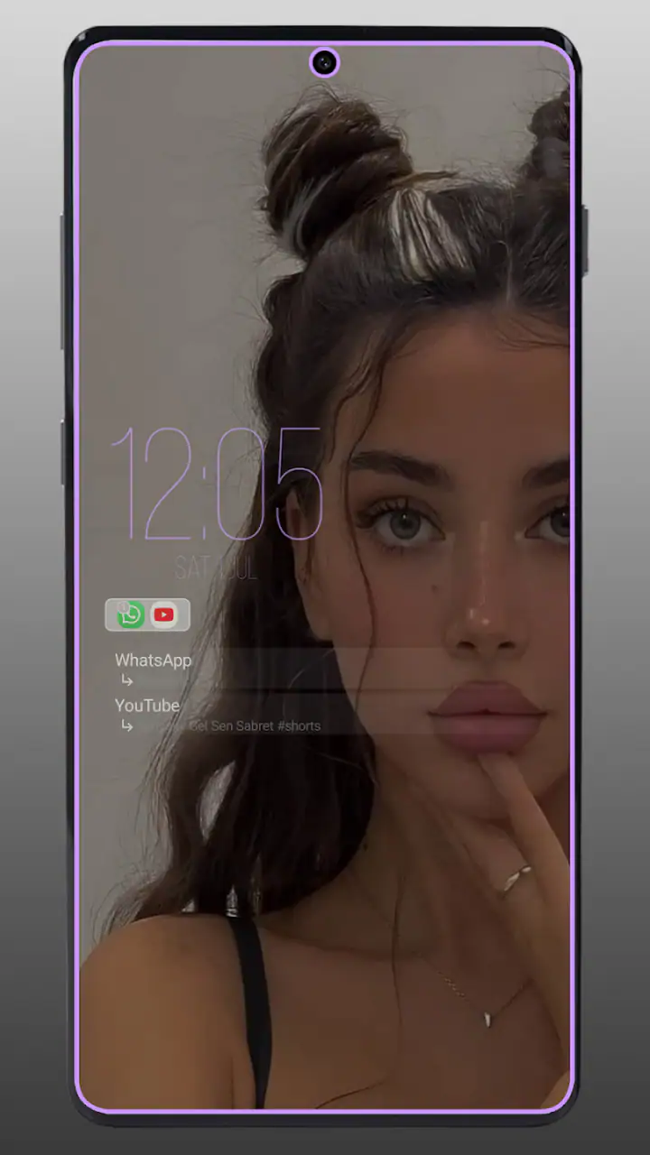
The app’s category is personalization, and that description fits better than calling it a complete accessibility tool. Its controls are designed to change how the phone looks and signals activity. They may support an individual routine, but they do not replace the phone’s built-in text-size, contrast, sound, vibration, or screen-reader settings. I would use those native tools first when the goal is direct access to content rather than visual atmosphere.
What helps people who need stronger visual cues?
A moving border can be easier to notice than a small status icon, especially when the phone is lying face up nearby. This is one of the more practical strengths of the app. The edge of the screen creates a broad signal, so I do not have to stare at one precise corner to know that something changed. For users who miss subtle icons, that extra visual presence may make the phone feel more responsive.
There is a trade-off, though. A border that is too bright, fast, or colorful can become distracting rather than supportive. People with light sensitivity, migraine triggers, visual fatigue, or sensory processing differences may prefer the least animated option available and a lower brightness level. I would test the effect in a dim room as well as in daylight, because a setting that looks gentle during the day can feel intrusive at night.
Color alone is also a weak way to communicate meaning. If an alert is represented only by a particular shade, users with color-vision differences may not receive the intended distinction. I would pair the visual cue with readable notification content or an existing sound or vibration pattern. That way, the lighting adds redundancy instead of carrying the entire message.
Motor effort and hands-free moments
One quiet advantage is that the app can reduce unnecessary touches. If I can see that a notification arrived without unlocking the phone, I avoid a chain of taps, swipes, and back-button actions. That may help people with hand fatigue, tremor, joint pain, or temporary situations where reaching the phone is awkward. It is also convenient when the device is mounted, resting on a stand, or positioned just outside comfortable reach.
However, the app does not remove every physical interaction. Reading the full message, replying, changing a setting, or investigating an unclear alert still requires the ordinary phone interface. The edge effect is therefore a first step in the interaction, not a hands-free replacement for the operating system. If a person needs voice control or switch access, those system-level options remain more important than the lighting layer.
I also would not rely on the effect for urgent communication. A visual animation can be missed if the screen is turned away, covered, too far away, or competing with bright surroundings. For critical reminders, combining the app with sound, vibration, or another established alert method is safer than assuming the border will always be noticed.
Using the app in different places and routines
A realistic desk and evening routine
Imagine working at a desk with the phone beside a keyboard. I may not want a sound for every message, but I do want to know whether something arrived before opening a work task. A short edge animation gives me a peripheral cue, while the always-on display lets me check the time without touching the device. If the alert is not important, I can keep working. If it is, I can pick up the phone deliberately instead of checking it repeatedly.
In the evening, the same setup needs more care. A bright display or persistent border can disturb a dark room, and a visually active screen may be uncomfortable for someone trying to sleep. I would use a calmer appearance at night and check whether the phone’s own display behavior still suits the routine. The app is useful here only when its visibility is balanced; more light is not automatically better access.
Public spaces and noisy environments
In a busy street, café, or public building, sound notifications may be hard to hear or inappropriate to use. A visible edge cue can provide a discreet alternative, particularly when the phone is on a table and facing upward. This is a good example of situational access: the app does not change a person’s hearing, but it offers another channel for noticing activity.
Outdoor visibility introduces the opposite problem. Strong daylight can reduce the impact of subtle colors and thin border effects. I would not judge the configuration indoors and assume it will perform equally well outside. A user who often works outdoors should prioritize a clear, high-contrast always-on display and treat the lighting as secondary.
Shared spaces and privacy
The always-on display can be convenient in a shared office or home, but visible information may also expose more than intended. A glanceable screen is still a screen that other people can see. I would be careful about displaying message details in public or leaving the phone face up during private conversations. The app’s convenience should not encourage a habit of broadcasting notification content to everyone nearby.
This is another reason I prefer using the edge as an attention signal while keeping the visible text limited. A border can tell me that I should check the phone without immediately presenting the entire message. That balance is especially useful for people who need a large visual cue but also want more control over privacy.
Battery, attention, and visual clutter
An always-on display and repeated lighting naturally make the phone more active than a completely idle screen. The practical cost will vary with the device and configuration, so I would monitor the phone over a normal day rather than assuming the effect is free. If battery endurance matters more than instant glanceability, a simpler setup or less frequent lighting may be the better choice.
There is also an attention cost that cannot be measured only in battery use. A constantly animated border can pull me away from tasks, even when the notification is unimportant. I found the concept more successful when the visual treatment was selective and calm. Personalization should make the phone easier to interpret, not turn every small event into a demand for attention.
Where the usual alternatives are stronger
Android’s built-in always-on display or notification settings may be the better option for someone who wants fewer layers between the operating system and the phone screen. Native controls are usually the natural starting point for text size, contrast, sound, vibration, and screen-reader support. They may also feel more predictable after a system update because they belong to the device’s own interface.
A simple notification LED, if a phone has one, can be less visually impressive but easier to understand. A smartwatch can provide a stronger tactile signal for people who often miss phone alerts, while a sound or vibration pattern may be more suitable for urgent reminders. Always On Edge Lighting & AOD makes sense when the border effect itself solves a real visibility problem or when the phone lacks a glanceable signal that the user prefers.
I would skip it if I dislike persistent screen elements, react badly to flashing or bright visuals, or want a completely maintenance-free setup. I would also look elsewhere if my main need is advanced accessibility support rather than personalization. In that case, the phone’s native accessibility features and dedicated notification methods should come first.
Practical adjustments that improve the experience
My first tip is to design for the weakest viewing condition, not the prettiest screenshot. Check the display from a normal sitting position, from the side, in bright daylight, and in a dark room. If the effect is only useful when I am looking directly at it, it may not be solving the intended problem.
My second tip is to use redundancy. Keep the edge cue for quick awareness, but retain a sound, vibration, or readable notification for anything important. This is particularly valuable for users who may miss color, movement, or a screen that is not facing them. The app works best as one part of a notification system rather than the only channel.
My third tip is to separate attention from identification. I use the border to answer “should I check the phone?” and the notification text to answer “what happened?” Expecting the animation to communicate the sender, urgency, and meaning at once creates confusion, especially when several alerts arrive together.
Finally, I would revisit the setup after a few days. The most attractive configuration on the first evening may become tiring after repeated use. Reducing visual intensity, simplifying the display, or limiting when I want the effect can make the app more sustainable. Good personalization is not the configuration with the most options enabled; it is the one that remains helpful without becoming another source of friction.
Cost, compatibility, and everyday expectations
The app is free, which makes it easy to test without committing money at the start. Optional in-app purchases range from ninety-nine cents to four dollars and forty-nine cents per item. I would try the basic experience first and decide whether the additional customization is genuinely useful for my routine rather than paying simply because more visual choices are available.
It requires Android 8.1 or later, so compatibility is broad enough for many older devices while still excluding phones running earlier software. The age classification is Everyone, which matches the app’s purpose as a visual phone-customization tool. Still, a general age rating does not tell me whether the lighting style will suit every sensory preference, so personal comfort remains the more important test.
Because the app changes a system-level visual habit, I would pay attention after installing a new phone update or changing display settings. If the always-on behavior or border cue becomes inconsistent, checking the app and device settings together is more sensible than assuming one side is entirely responsible. This is the kind of product that benefits from occasional adjustment, especially on phones with their own display-saving or notification rules.
My inclusive verdict
Always On Edge Lighting & AOD is a useful personalization layer for people who benefit from a larger visual prompt than a small notification icon. I like its strongest use case: placing the phone nearby, noticing a calm edge signal, and deciding whether interaction is worth the interruption. That can support different routines, hearing preferences, busy hands, and moments when touching the phone repeatedly is inconvenient.
Its limits are just as important. The app does not make every notification understandable, does not replace native accessibility tools, and cannot guarantee that a visual effect will be noticed in every environment. Brightness, movement, battery use, privacy, and color interpretation all need personal consideration. Someone with sensory sensitivity may prefer a very restrained setup, while someone who needs tactile or spoken feedback may be better served by another notification method.
The best reason to use it is not that the border looks impressive, but that a carefully tuned visual cue makes your phone easier to notice on your own terms. I would recommend trying the free version when glanceable visual access is the specific problem. I would not recommend treating it as a universal accessibility solution or enabling every effect without testing comfort and reliability. Used selectively, it adds a practical extra signal; used indiscriminately, it can become bright, distracting, and less informative than the phone’s simpler built-in options.
For me, that makes the app worthwhile for visual notification awareness, especially on a desk or in a quiet public setting. The strongest experience comes from moderation: readable information, restrained lighting, and another alert channel available when the message truly matters. That balance is where this personalization app earns its place.
FAQs for Always On Edge Lighting & AOD
What is Always On Edge Lighting & AOD used for?
Always On Edge Lighting & AOD is designed to make notifications easier to notice while adding a decorative effect to your phone’s screen. It can display colorful lighting around the edges, show an always-on display with useful information, and provide visual alerts for calls, messages, and selected apps. The available functions may vary depending on your Android version, device model, and granted permissions.
Does Always On Edge Lighting & AOD work on every Android phone?
The app is intended for many Android smartphones, but its performance and available features can differ considerably between devices. Screen shape, display technology, manufacturer restrictions, battery-saving settings, and Android permissions may affect edge animations or always-on display behavior. Before downloading, check that your phone supports the required Android version and be prepared to adjust display, notification, and battery settings for reliable operation.
What permissions does the app require, and are they safe to grant?
To provide notification lighting and always-on display features, the app may request permissions such as notification access, displaying over other apps, accessibility access, and permission to run in the background. These permissions are important for detecting notifications and showing visual effects, but they should be reviewed carefully. Grant only the access you understand, and disable permissions if you no longer use the related feature.
Will Always On Edge Lighting & AOD drain my battery?
Battery usage depends on how frequently the lighting effects appear, how long the always-on display remains active, screen brightness, animation style, and your device’s display technology. On AMOLED phones, dark AOD designs may be relatively efficient, while bright animations and frequent notifications can consume more power. The app usually offers timing, brightness, charging, and screen-off options to help reduce battery impact.
Is Always On Edge Lighting & AOD free to download?
The application can generally be downloaded without an upfront charge, but some features may be supported by advertising or offered through in-app purchases. Premium options may include additional lighting styles, customization tools, themes, or an ad-free experience. Pricing and available content can change over time, so review the store listing and purchase screen carefully before subscribing or unlocking paid features.
Pros
- Highly customizable edge-lighting colors
- patterns
- and animation speeds.
- Supports lighting effects for selected contacts and individual app notifications.
- Offers useful AOD clock styles with adjustable position and appearance.
- Can display charging effects and battery information on the screen.
- Includes options to limit effects by schedule
- battery level
- or device state.
Cons
- Some advanced customization options require a premium purchase.
- Notification access permissions may concern privacy-conscious users.
- Continuous lighting and AOD features can increase battery consumption.
- Setup may feel complicated because of its many settings and menus.
- Compatibility can vary across phones
- especially with custom Android interfaces.


